Recently, my wife needed to create some stacked bar graphs for her publications. She wasn’t able to find a tool on the internet which allowed her to do this in an easy and shareable way. So I used this opportunity to look into Jupyter Notebooks. These notebooks allow you to document and run code and thus computations on a remote server from your browser and display the results directly in your browser as well
Google offers their version of Jupyter as a free service called Colab. Already having a Google account it was an easy choice to start there. But there are other similar services available on the internet and the code should run there as well (with minimal changes).
The file is quite self explanatory and can be saved within your own Google drive for editing. You can find it here.
The Notebook
This notebook will create a horizontal stacked bar graph within your browser based on the data you enter below. Just edit the data in 1) and execute the “gray blocks” in 1), 2) and 3) by either pressing “Shift + Enter” or the “Play” button in each blocks top left corner. To see the “Play” button you need to move your mouse over the block.
You can change the design of the graph in 2). This includes the unit which should be displayed on the bar. You will moste likely need to change the position of the legend as it depends on the data and size of the graph. To do this, change the x value of FigLegPosOffset slightly.
The code within a block is written in Python. Everything after a # is considered a comment. So you can add your own comments to your data or your changes.
1) Preparing the Data
Define your data below and execute the block when done. If everything is correct, your data will be displayed as table below the block.
# importing the functions needed to generate the graph
import pandas as pd
# Axis captions
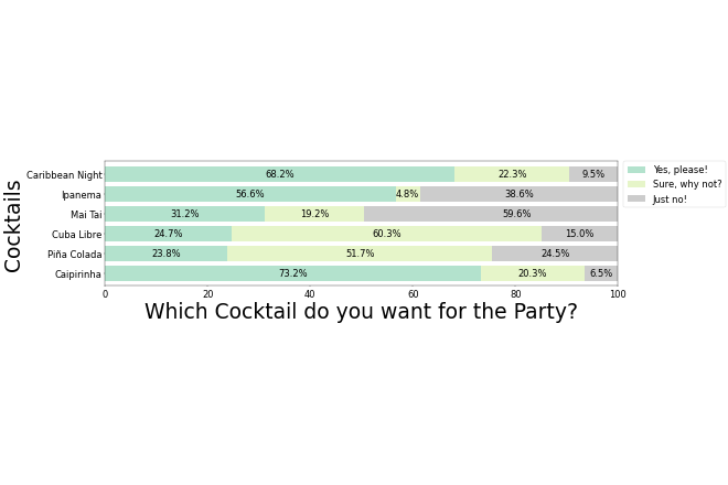
FigAxiXCap="Cocktails"
FigAxiYCap="Which Cocktail do you want for the Party?"
# Data (beware: the first entry will be displayed last)
## Data Indexes
DataIndexes = ['Caipirinha', 'Piña Colada', 'Cuba Libre', 'Mai Tai', 'Ipanema', 'Caribbean Night']
## Data Options
DataYesPlease = [73.2, 23.8, 24.7, 31.2, 56.6, 68.2]
DataSureWhyNot = [20.3, 51.7, 60.3, 19.2, 4.8, 22.3]
DataJustNo = [ 6.5, 24.5, 15, 59.6, 38.6, 9.5]
## Name of each column (for the legend)
df = pd.DataFrame(data={'Yes, please!': DataYesPlease, 'Sure, why not?': DataSureWhyNot, 'Just no!': DataJustNo})
#-------------------------------------------------------------------------------
#no need to edit below this line
df.index = DataIndexes
# print table for convinience/debugging (transposed)
df
2) Figure Properties
In the block below you can change the format of the figure. When done (or fine with the defaults) execute it to set all properties.
#################
# Figure Design #
#################
#Figure
## Figure Size
FigSizeX = 20
FigSizeY = 5
## Figure background color
FigBackColor="white"
## Axis Caption Size
FigAxiXCapFontSize=45
FigAxiYCapFontSize=45
## Axis Labels Font Size
FigLabelFontSize=20

# Blocks
## Colormap of the blocks (all Options: https://matplotlib.org/stable/gallery/color/colormap_reference.html
FigColMap="Pastel2"
## Width of bars (everything above 1 will overlap)
FigBarsWidth=0.8
## FontSize of bar lables
FigBarsFontSize=20
# Data and Captions (needs to be defined)
## Unit to display within bars
FigBarUnit="%"

# Legend
## Legend Font Size
FigLegFontSize=20
## Legend position [best|upper right|upper left|lower left|lower right|right|center left|center right|lower center|upper center|center]
FigLegPos="upper center"
## Figure OffSet (will move the legend box slightly to match actual figure position)
FigLegPosOffset=(1.11, 1.0)

## 3) Generate and Display the Figure
The block below will generate the figure. You do not need to change anything here. Just be sure to execute it again **after changing anything above**.

# define plot type and layout
ax = df.plot(stacked=True, kind='barh', figsize=(FigSizeX, FigSizeY), colormap=FigColMap, width=FigBarsWidth, fontsize=FigBarsFontSize, xlim=[0,100])

# Add labels to the bars
# Attribution: Trenton McKinney on StackExchange: https://stackoverflow.com/a/60895640/3764407 CC BY-SA 4.0
for rect in ax.patches:
    # Find where everything is located
    height = rect.get_height()
    width = rect.get_width()
    x = rect.get_x()
    y = rect.get_y()

    # The width of the bar is the data value and can be used as the label
    label_text = ""
    if width > 4:
      label_text = f'{width:.1f}' + FigBarUnit  ##### use {width:.2f} or {width:.3f} to increase precision  ####

    # ax.text(x, y, text)
    label_x = x + width / 2
    label_y = y + height / 2

    # plot only when height is greater than specified value
    if height > 0:
        ax.text(label_x, label_y, label_text, ha='center', va='center', fontsize=FigBarsFontSize)

# Set legend position and style
ax.legend(bbox_to_anchor=FigLegPosOffset, loc=FigLegPos, borderaxespad=0., fontsize=FigLegFontSize)
# Set y label
ax.set_ylabel(FigAxiXCap, fontsize=FigAxiXCapFontSize)
# Set x label
ax.set_xlabel(FigAxiYCap, fontsize=FigAxiYCapFontSize)
# Set Background Color
ax.set_facecolor(FigBackColor)
3) Generate and Display the Figure
The block below will generate the figure. You do not need to change anything here. Just be sure to execute it again after changing anything above.
define plot type and layout
ax = df.plot(stacked=True, kind='barh', figsize=(FigSizeX, FigSizeY), colormap=FigColMap, width=FigBarsWidth, fontsize=FigBarsFontSize, xlim=[0,100])

# Add labels to the bars
# Attribution: Trenton McKinney on StackExchange: https://stackoverflow.com/a/60895640/3764407 CC BY-SA 4.0
for rect in ax.patches:
    # Find where everything is located
    height = rect.get_height()
    width = rect.get_width()
    x = rect.get_x()
    y = rect.get_y()

    # The width of the bar is the data value and can be used as the label
    label_text = ""
    if width > 4:
      label_text = f'{width:.1f}' + FigBarUnit  ##### use {width:.2f} or {width:.3f} to increase precision  ####

    # ax.text(x, y, text)
    label_x = x + width / 2
    label_y = y + height / 2

    # plot only when height is greater than specified value
    if height > 0:
        ax.text(label_x, label_y, label_text, ha='center', va='center', fontsize=FigBarsFontSize)

# Set legend position and style
ax.legend(bbox_to_anchor=FigLegPosOffset, loc=FigLegPos, borderaxespad=0., fontsize=FigLegFontSize)
# Set y label
ax.set_ylabel(FigAxiXCap, fontsize=FigAxiXCapFontSize)
# Set x label
ax.set_xlabel(FigAxiYCap, fontsize=FigAxiYCapFontSize)
# Set Background Color
ax.set_facecolor(FigBackColor)
4) Download the Figure (from Google Colab)
To export the generated figure use the following block. You can change the file name and type as well as its resolution (dots per inch/DPI).
# Define the file name
FigureFileName="figure"
# Define the type (jpg, png, pdf, svg)
FigureFileType="png"
# Define DPI (setting this too high might result in long wait times and finally an error)
FigureDPI=30

# do not edit below
FigFile=FigureFileName + "." + FigureFileType
ax.figure.savefig(FigFile,dpi=FigureDPI,bbox_inches = 'tight')
from google.colab import files
files.download("/content/" + FigFile )
Leave a Reply