Most modern user interfaces are supporting different color schemes for day and night: the so called light and dark modes. Selecting a text color for each of those modes is not a big deal and it’s the way to go when designing the user interface.
In some cases, the text color is driven by the displayed contents. In the example below, the tint color is matched to the color of the drink. The global tint color of this app is totally different, but this color adjustment gives a very nice effect. But as you might already see, there is a small problem when it comes to very light or very dark colors: each color either has a good readability on light or dark backgrounds. Some colors might fit to both, but that’s not always the case. In the example below, the light yellow is still visible, but when it comes to small icons or small text, the details are lost.
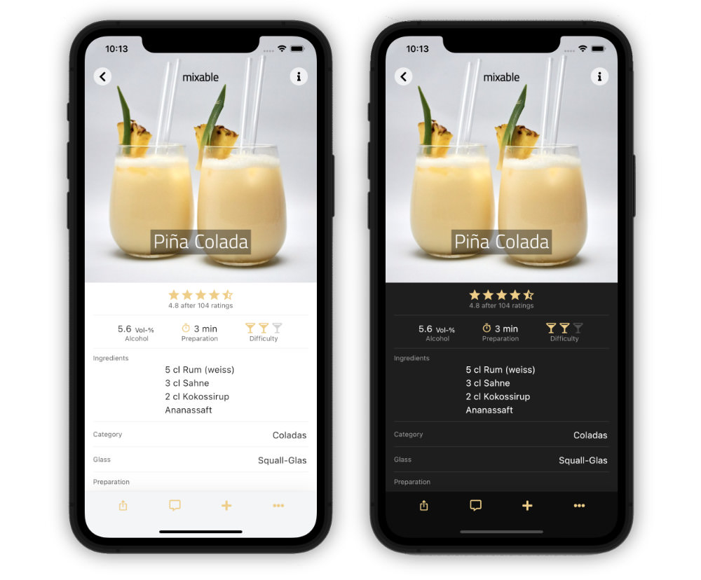
To overcome this issue, a simple solution is to select two colors for each recipe so that each mode has a different one. That’s fine, but it might totally change the effect of this colored pages.
How can we calculate a suitable color?
Some time ago, there was an article about Black or white text on a colour background? In this one, I described different algorithms to calculate the best text color (black or white) for a colored background. But now, we need the opposite: a colored text that has a good readability on white (light) or black (dark) backgrounds.
When we look at HSL and HSV/HSB color models, we already have a value for ‘lightness’ or ‘brightness’. The idea is to find a color that matches a given hue and saturation and that has a brightness which is readable on light and dark background. For this, we can use different algorithms. Very good results could be achieved with a ‘Weighted W3C Formula‘. This formula take into consideration that the human eye perceives some of the primary colors darker than others.
f'(x) = r \cdot 0.299 + g \cdot 0.587 + b \cdot 0.114
Each color that is located at the border between the black and white overlay is suitable for light and dark backgrounds.

Adjusting the HSV color value
Step 1: convert the given color to HSV/HSB
Step 2: keep hue and saturation constant, adjust the brightness (make the color lighter or darker)
Step 3: convert the HSV/HSB value back to the required color format
Implementation in PHP
A simple calculation for a given RGB color is shown below. The classes used in this snippet are available on GitHub. The code checks the initial brightness of the color and lightens or darkens the values until the ‘border’ calculated by the ‘Weighted W3C Formula’ is reached. This is the case for the value 127, the total range of the brightness is 0 to 255.
$hsv = Convert::rgb2hsv($rgb);

$step = 0.01;
$brightness = Calculate::weightedW3C($rgb);
if ($brightness < 127) {
    while ($brightness < 127 && $hsv[2] >= 0 && $hsv[2] <= 1) {
        $hsv[2] += $step;
        $brightness = Calculate::weightedW3C(Convert::hsv2rgb($hsv));
    }
} else {
    while ($brightness > 127 && $hsv[2] >= 0 && $hsv[2] <= 1) {
        $hsv[2] -= $step;
        $brightness = Calculate::weightedW3C(Convert::hsv2rgb($hsv));
    }
}

return Convert::hsv2rgb($hsv);
Some examples
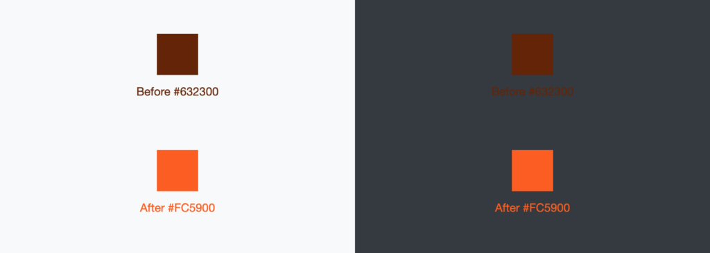
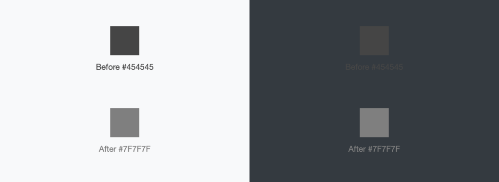
But how does this result look for different colors? Let’s start with some dark colors. Those are fine for a light background, but they become unreadable on a dark one. The top colors show the input color (before) and the color below shows the output of the calculation above (after).
And now let’s look at some light colors which are fine for dark backgrounds, but they are totally unreadable on light backgrounds.
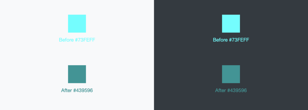
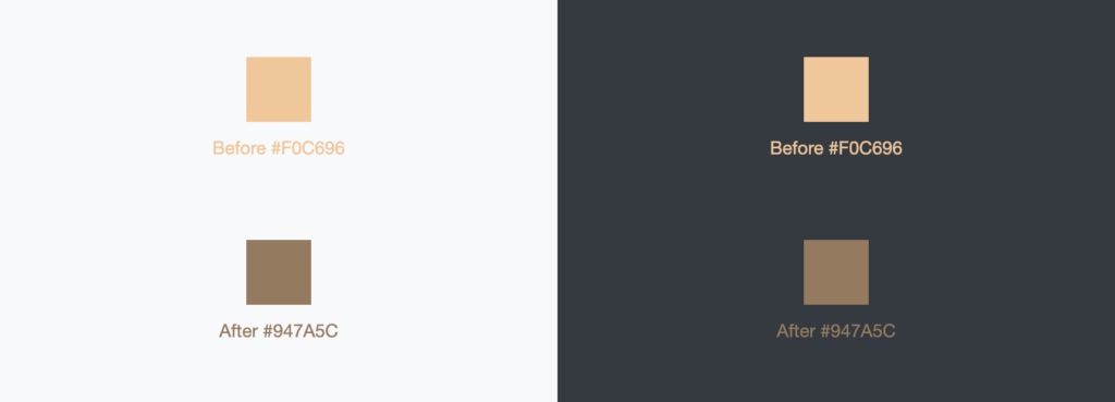
The last color is similar to the example at the beginning and as you can see, the optimized color has a much better readability. This could be achieved for both light and dark colors.
Adjusting the HSL color value
Step 1: convert the given color to HSL
Step 2: keep hue and saturation constant, adjust the lightness (make the color lighter or darker)
Step 3: convert the HSL value back to the required color format
Implementation in PHP
A simple calculation for a given RGB color is shown below. The classes used in this snippet are also available on GitHub. The code checks the initial brightness of the color and lightens or darkens the values until the ‘border’ calculated by the ‘Weighted W3C Formula’ is reached. This is the case for the value 127, the total range of the brightness is 0 to 255.
$hsl = Convert::rgb2hsl($rgb);

$step = 0.01;
$brightness = Calculate::weightedW3C($rgb);
if ($brightness < 127) {
    while ($brightness < 127 && $hsl[2] >= 0 && $hsl[2] <= 255) {
        $hsl[2] += $step;
        $brightness = Calculate::weightedW3C(Convert::hsl2rgb($hsl));
    }
} else {
    while ($brightness > 127 && $hsl[2] >= 0 && $hsl[2] <= 255) {
        $hsl[2] -= $step;
        $brightness = Calculate::weightedW3C(Convert::hsl2rgb($hsl));
    }
}

return Convert::hsl2rgb($hsl);
Some examples
The top colors show the input color (before) and the color below shows the output of the calculation above (after). Let’s check for the same colors that have been used in the HSV code above.
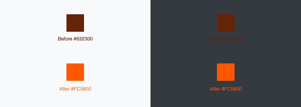

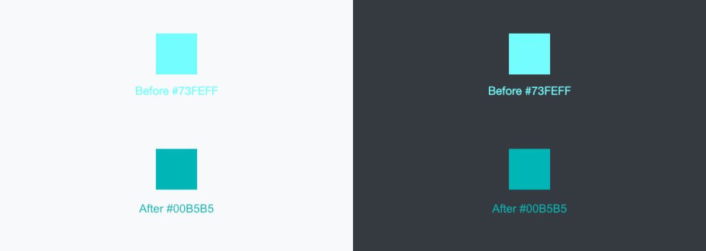
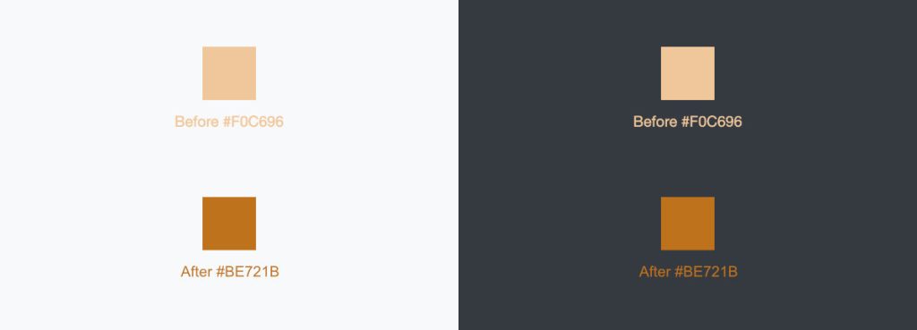
Again, the optimized colors have a much better readability for both light and dark backgrounds.
Conclusion
For both solutions using the HSV or the HSL color value, the optimized colors have a much better readability. This is possible for both light and dark colors. Compared to the HSV solution, the HSL value results in some more “colorful” colors. But the readability is similar. Based on the brightness calculation using the ‘Weighted W3C Formula’, both solutions result in adjusted color values with a good readable brightness.
The code example shown above are written in PHP. An adoption should be easily possible for any other coding or scripting language.
The algorithm mentioned in this post is also available on GitHub:
https://github.com/mixable/color-utils. This package is usable with composer:
composer require mixable/color-utilsUsing those classes, optimized colors can be calculated by using the following code. Since version 1.0.5, the library supports both solutions using the HSV or the HSL color value:
use Mixable\Color\Calculate;
// ...

// Calculate readable color using _HSL_ value
$optimizedColor = Calculate::readableColorForLightAndDarkBackground('#ffcc00');

// Calculate readable color using _HSV_ value
$optimizedColor = Calculate::readableColorForLightAndDarkBackgroundHsv('#ffcc00');
Leave a Reply